Debates in the Digital Humanities 2019 has a cover! It’s also available for preorder through the University of Minnesota Press. It will ship in April 2019.

Digital humanities, data science, and early American literature
Debates in the Digital Humanities 2019 has a cover! It’s also available for preorder through the University of Minnesota Press. It will ship in April 2019.
I’m delighted to announce that a draft of Data Feminism has been posted on the MIT Press open-access website for online community review. We will be reviewing comments through January 7th, 2019. More information is available on the PubPub site.
What follows is the text of a talk delivered at the 2018 MLA Annual Convention for a panel, “Varieties of Digital Humanities,” organized by Alison Booth and Miriam Posner. Marisa Parham, Alan Liu, and Ted Underwood were the other speakers. (Howard Ramsby was also scheduled to present, but he was unable to attend because of the blizzard). Ted’s remarks can also be found on his website.
***
I don’t have much time, so I’ll get right to the point—
The question I want to explore today is this: what do we do about distant reading, now that we know that Franco Moretti, the man who coined the phrase “distant reading,” and who remains its most famous exemplar, is among the men named as a result of the #MeToo movement.
I feel deeply for his victims. But given the context of this panel, what I want to focus on, today, is how his actions might prompt us to revisit some more longstanding issues regarding gender, power, and distant reading (which, following Andrew Goldstone, I’ll use in the lowercase-d lowercase-r sense to refer to the subset of computational methods that derive from statistical modeling and computational linguistics that are most commonly applied to analyze texts at scale).
Because sexual harassment is a structural, as well as personal problem, as Sara Ahmed has recently observed. By describing it a structural problem, Ahmed calls attention to how sexual harassment is sustained not only by the harassers themselves, but also by the institutions that shelter them. She explains how the confidential nature of most institutional inquiries ensures that “people remain, networks stay alive, and structures and processes are not put under investigation.” This is in large part because no one outside of the individual actors gets to know what happened, and as a result, the structural nature of the problem never becomes visible.
Ahmed’s work focuses on institutional structures, and academic institutional structures in particular. But the problems associated with ending harassment are not limited to academic structures alone. They also derive from flaws in cultural and conceptual structures as well—
So it’s here that I want to try to apply Ahmed’s lessons of structural power to the problems of power we face—still—with respect to lowercase-d lowercase-r distant reading in DH. Because as surprising as it might have been to some, when the allegations against Moretti surfaced, I don’t think it would be surprising to anyone in this room to bring up the many critiques that have been levied over the years at distant reading, and about how that particular field is, we might say, unwelcoming to women. These include critiques from the early 2010s by Moya Bailey, Miriam Posner, and the #transformDH collective about issues of representation in the field; critiques from around that same time by Bethany Nowviskie and others on Twitter that called out distant reading for its unduly masculinized rhetorical positioning; more recent work by Lisa Rhody, Tanya Clement and Jessica Marie Johnson that points out its failure to engage with the conceptual issues that relate to women—most obviously gender, but also sexuality, race, class, and ability, among many others. And then, in recent work by Laura Mandell, we see a critique of the actual computational models of gender that are often deployed when applying distant reading approaches to texts.
(And I would be remiss if I did not take a moment to acknowledge the critiques that have been levied against the #MeToo movement itself, by which I refer to its erasure of the voices of the Black women who did the earliest and most difficult work).
In fact, Ahmed’s structural critique of harassment helps show us how these issues are all related. Generalized racism and sexism, as well as the more specific issue of sexual harassment, each result from the same disparities of power, and other structural inequalities, that enable larger cultures of violence and oppression. There are many ways that this interrelation can be manifested, and structural power reinforced. Not all of these ways are easily explainable, or even traceable to a single source. But here is one example that can be quickly (if somewhat essentially) described: that flaw in prosecution that I mentioned just a minute ago, in which the actors, networks, and systems that enable harassment remain in place? This flaw leads to workplace environments that are unwelcoming (if not outright hostile) to women and other minoritized groups. But it’s those very same people who would otherwise be best positioned to identify and challenge the instances of sexism, or racism, or other forms of oppression that they see—not only in their institutional environments, but also in their scholarly work. Without those voices, conceptual structures, as well as institutional ones, remain securely in place, unchallenged and unchanged.
To put the problem another way: it’s not a coincidence that distant reading does not deal well with gender, or with sexuality, or with race. Gender and sexuality and race are precisely the sorts of concepts that have been exposed and interrogated by attending to non-dominant subject positions. And like literary world systems, or “the great unread,” the problems associated with these concepts, like sexism or racism, are also problems of scale, but they require an increased attention to, rather than a passing over, of the subject positions that are too easily (if at times unwittingly) occluded when taking a distant view.
So, then, what to do about it.
I think we need to start with our corpora. We need to assemble more corpora—more accessible corpora—that perform the work of recovery or resistance. An example: the corpus created by the Colored Conventions Project, which seeks to recover and aggregate evidence that documents the Colored Conventions of the nineteenth-century United States; these were organizing meetings in which Black Americans, both fugitive and free, came together to strategize about how to achieve social and legal justice. By making this corpus available for others to download, the CCP opens up the project of distant reading to texts beyond quote “representative” samples, which tend to reproduce the same inequities of representation that affect our cultural record as a whole.
We also need to rethink how we formulate our models. Instead of first asking what can be modeled—what phenomena we can track at scale—we might instead ask: what might be hidden in this corpus? And are there methods we might use to bring out significant texts, or clusters of words, that the eye cannot see? Another example: for the past several years, I’ve been working on a project that applies a set of distant reading techniques to a corpus of nineteenth-century abolitionist newspapers. I’ve been focused on the issue of gender, and on how the influence of key men and women can be tracked across the corpus in terms of both content and tone. But the limits of named entity recognition, which I used to develop my initial set of actors and events, required that I begin with the actors and events that could be automatically detected—rather than with the influences that could not be reduced to a single, computationally-tractable source. But it’s precisely the forms of influence that cannot be traced to a single point of origin that best reflect the distributed nature of structural power. And modeling those forms of influence is far harder, as I can personally attest. But those models that are increasingly necessary—lest we inadvertently reinscribe the same power relations that we intend to critique.
There are, of course, other things we can do better to connect the project of distant reading to the project of structural critique. But my time is nearly up, so I’ll end with this: it’s not that distant reading can’t do this work—it’s that it’s yet to sufficiently do so. But if we re-commit ourselves to the project of exposing and interrogating power, we could arrive at a form of distant reading that is much more capacious, and much more inclusive, than what we have at the present. Because the view from a distance, is, of course, as much of a view from a particular place as a view from up close. And it may very well be that a distant view that is trained on power, and that is self-reflexive about the forces that enable it—cultural and conceptual as well as computational—can contribute, significantly, to the project of dismantling structural power. Indeed, this project of critiquing power and working towards justice is the most pressing project of our time.
What follows is the text of my talk at the 2017 MLA Annual Convention, slightly modified for the web. I spoke on a panel that showcased new forms of nineteenth-century digital scholarship. (Also featured were Mark Algee-Hewitt and Annie Swafford). An essay-length version of the talk is in the works, but since I’m heads-down on my book manuscript at the moment, I’m posting my remarks here.
NB: If you’d like to read some of the more design-oriented work I’ve done on the subject, please see my paper from the 2016 IEEE VIS conference, co-authored with Catherine D’Ignazio, that outlines our principles of feminist data visualization and specifies some design questions for engaging them.
This talk departs from a seemingly simple question: “What is the story we tell about the origins of modern data visualization?” And as a set of follow-ups, “What alternate histories might emerge, what new visual forms might we imagine, and what new arguments might we make, if we told that story differently?”
To begin to answer these questions, I’ll focus on the work of one visualization designer from the nineteenth century, Elizabeth Palmer Peabody, whose images are rarely considered in the standard story we tell about the emergence of modern visualization techniques. When they are mentioned at all, they are typically described as strange—and sometimes even as failures. You can see one of them just below.

To us today, accustomed to the charts and graphs of Microsoft Excel, or the interactive graphics that we find on The New York Times (dot com) on any given day, we perceive schemas like this as opaque and illegible. They do none of the things that we think that visualization should do: be clear and intuitive, yield immediate insight, or facilitate making sense of the underlying data. But further questions remain: why have we become conditioned to think that visualization should do these things, and only these things? How has this perspective come to be embedded in our visual culture? And most importantly for us here today, what would it mean if we could view images like these, from the archive of data visualization, instead as pathways to alternate futures? What additional visual schemas could we envision, and what additional stories could we tell, if we did?
So I’m going to inhabit my method, and frame my talk today in terms of an alternate history. First, I’ll walk you through the visual schema that you see above-left, proposed by Peabody in 1856. Then I’ll talk about some of the more speculative work I’ve done in attempting to reimagine her schema in both digital and physical form. And then I’ll try to explain what I’m after by describing this work, as you saw in the title of this talk, as feminist—
More specifically, I’ll show how Peabody’s visual method replaces the hierarchical mode of knowledge transmission that standard visualization techniques rest upon with a more horizontal mode, one that locates the source of knowledge in the interplay between viewer, image, and text. I’ll demonstrate how this horizontal mode of knowledge transmission encourages interpretations that are multiple, rather than singular, and how it places affective and embodied ways of knowing on an equal plane with more seemingly “objective” measures. And finally, I’ll suggest that this method, when reimagined for the present, raises the stakes for a series of enduring questions—about the issue of labor (and its relation to knowledge work), the nature of embodiment (and how it might be better attached to digital methods), and the role of interpretation (and how is not only bound to perception, but also design).
But I think that’s enough of a preamble. So, to begin.
Elizabeth Palmer Peabody was born in Massachusetts in 1804. Today, she is most famous for her proximity to more well-known writers of the American Renaissance, such as Emerson and Hawthorne. (Hawthorne was actually married to her sister, Sophia). But Peabody had impact in her own right: the bookstore that she ran out of her home, in Boston, functioned as the de facto salon for the transcendentalist movement. She edited and published the first version of Thoreau’s essay on civil disobedience, which appeared in her Aesthetic Papers, in 1849. And interestingly, she’s also is credited with starting the first kindergarten in the United States.
But in the 1850s, Peabody set off to ride the rails. She traveled as far north as Rochester, NY; as far west as Louisville, KY; and as far south as Richmond, VA, in order to promote the US history textbook she’d recently published: A Chronological History of the United States. Along with boxes of books, Peabody traveled with a fabric roll the size of a living room rug, which contained floor-sized versions of charts like the one in the image above, which I’ll tell you only now is a visualization of the significant events of the seventeenth century, as they relate to the United States. (This image that you see is a plate from the textbook, measuring, at most, 3 inches square).
In her version of a sales pitch, Peabody would visit classrooms of potential textbook adopters, unroll one of her “mural charts” (as she called them) on the floor, and invite the students to sit around it to contemplate the colors and patterns they perceived.
 Peabody’s design was derived from a system developed in Poland in the 1820s, which employed a grid, overlaid with shapes and colors, to visually represent events in time. At left you see, on the bottom left of the page, a numbered grid, with each year in a century marked out in its own box. On the top right you see how each box is subdivided. So, top left corner for wars, battles, and sieges; top middle for conquests and unions; top right for losses and divisions, and so on. And shapes that take up the entire box indicate an event of such magnitude or complexity that the other events in that year didn’t matter.
The basic exercise was to read the narrative account in Peabody’s textbook, and then convert the list of events that followed, like the one you see below-left, into graphical form. And I should note, at this point, that the events are color-coded, indicating the various countries involved in a particular event.
 So now I’ll return to the original chart (at left), and you can see now, hopefully, that England is red, the Americas are orange, and the Dutch are teal—those are the colors that dominate the image. The French get in on the act, too, in blue. And if you cross-reference the chart to the table of events, you can see, for instance, the founding of Jamestown in 1607; and the settlement of Plymouth in 1620—that’s the red on the right—and, interestingly, the little teal box stands for the first enslaved Africans arriving in Virginia at that same time.
But I think it’s safe to say that no one in this room could have known this without me explaining how to interpret the chart. And for researchers and designers today, who champion the clarifying capacity of visualization; or for those who believe that datavis is best deployed to amplify existing thought processes—for such people, Peabody’s design would be a complete and utter failure. For Peabody, though, this near-total abstraction was precisely the point. Her charts were intended to appeal to the senses directly, to provide what she called “outlines to the eye.” Her hope was that, by providing only the mental outline of history, and by insisting that each student interpret the outline of history for herself, she would conjure her own historical narrative, and in that way, produce historical knowledge for herself.
So this is where the feminist aspects of Peabody’s approach to data visualization begin to emerge. Anticipating some of the foundational claims of feminist theory, Peabody’s schema it insists upon a multiplicity of meanings, and locates knowledge in the interplay between viewer, image, and text. Hers is a belief in visualization, not as clarifying or illuminating in its own right, not as evidence or proof of results, but as a tool in the process of knowledge production.
 At this point, it also bears mention that for Peabody, the creation of knowledge took place through a second mode: through the act of creating the images themselves. Peabody also printed workbooks, with sheets like the one you can see at left, and she envisioned the exercise, ideally, as one not merely of cross-referencing events to their visual representation, but of constructing the images they would then study. So you can see one student’s attempt below-left. And below on the right is another, by someone who appears to have given up all together. (These images come from a blog post by the Beinecke, but I’ve traveled to several archives across the northeast U.S. and seen the same thing). I used to show these images to get a laugh, but I know now, because at this point I’ve tried it a number of times, that this method is a very hard thing to actually do.


But that seems to be both a liability of the form, and also the point. Peabody devised her method at a moment of great national crisis—the decade leading up to the Civil War—and she recognized that the nation’s problems would be difficult to solve. Her goal was to prompt an array of possible solutions—one coming from the creator of each chart. And her hope was that, by designing new narratives of the past, her students would also imagine alternate futures.
In fact it was this aspect of Peabody’s system—the idea that, by insisting that each student participate in the creation of each chart, they would also each create their own interpretations of them, that seeded my desire to reimagine these charts for the web.
I’d already recognized, in Peabody’s method of first scanning a list of events, then identifying the type of each event and the nations involved, and then plotting it on the chart, a method that was strikingly procedural. And the process of cross-referencing between text and image seemed to me, even more, like the form of interaction you see all over the web. But it was her insistence on the need to create the charts in order to create knowledge that confirmed my decision to pursue the project. What would we discover, about the past, or about the present, if we were to make Peabody’s scheme accessible to students and scholars today?
This was the point that I enlisted a graduate student in Human-Computer Interaction (HCI), Caroline Foster, who helped design the really beautiful site that you’ll see in a minute. And I was also fortunate to be able to work with two very talented computer science undergrads, Adam Hayward and Shivani Negi, who helped with the technical implementation. And together, we set about creating this site. (NB: Erica Pramer, who graduated last year, helped with an earlier version of the project).
Below you can see some screen-shots from the four interactive modes: “Explore” (top left), which shows you how the events and their visual representations align; “Learn” (top right), which guides you through Peabody’s original lesson; “Play” (bottom left), which gives you a blank grid to color in; and “Compare” (bottom right), which generates a timeline on the basis of the current dataset, and displays it alongside the data as it’s stored in CSV form, as it’s listed in the text, and as it’s displayed on Peabody’s grid. (There are also some narrative components of the site, and while we’re still fixing bugs and tweaking the text, we encourage you to explore the site and send us your feedback).


There’s a lot more to be said about the eerily object-oriented way in which Peabody structures her data, and I touch on that in one of the interactive elements of the site, but in terms of my current argument, the salient point is how the clarity and legibility of the timeline, by contrast to Peabody’s grid, shows just how conditioned we’ve become to certain ideas about what visualization should and should not do. To us today, accustomed to a standard typology of visual forms, we can form a really quick rank order of these images. The timeline is better, we say, because it yields immediate insight. Who the heck knows what is going on with that grid?!
But what if we understood the purpose of visualization differently? What if we were supposed to stop and think hard about what we were seeing, and what it meant?
For my part, I’ve been thinking about Peabody’s charts in their most striking instantiation—those mural charts on the floor—and how they demand a different mode of sensory engagement altogether. They replace the decorative and utilitarian function of a rug with an experience designed to generate knowledge, and in so doing, they require viewers to reconsider the actual position of their bodies in relation to their objects of knowledge.
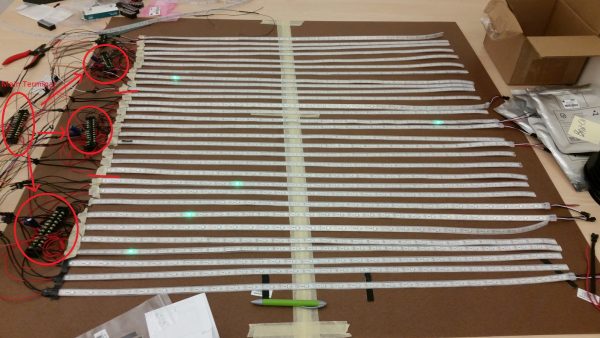
 This feature has prompted me to undertake a second project to implement a floor-size version of Peabody’s charts, which you can see at lest in some very early phases. (You can read about our current progress on the DH Lab blog). So in the top image, you see a matrix composed of 900 individually addressable LEDs, and in the bottom, you see the touch interface that we’re developing, which makes use of conductive tape and neoprene in an almost matrix-like keyboard interaction, so that you’ll be able to toggle each square off and on. And as my students and I carefully measure each strip of tape, and solder each part of each circuit together, I think back to Peabody’s own process of fabrication.
When I mentioned that she made floor-sized versions of the charts as a sort of marketing ploy, what I didn’t mention was that, as an additional incentive, she promised a handmade chart to any classroom that purchased the book. Writing to a friend in 1850, Peabody revealed that she was “aching from the fatigue” of making the charts for each school. She described how she would stencil shapes and colors onto a large piece of fabric, and how a single one took her 15 hours. As you can see from the text of the letter, she yearned for her book to become profitable so that she could hire someone to “do this drudgery for [her].”
It speaks both to poor book sales, and to the perceived lack of value of the charts, that none have been preserved. But what we do have, in letters like these, is evidence of the actual physical labor, as well as of the knowledge work, involved in producing these charts. And more specifically, with her references to the fabric and to the drudgery, it’s labor in feminized form.
Let me take some time unpack this, because it’s this observation that I want to end with, as I return to the question of alternate histories, and their impact on how we produce knowledge.
A lot of people—or, well, the handful who have ever thought to comment on Peabody’s work—observe that Peabody’s charts look like Mondrian paintings. And it’s true that, in their abstraction, they evoke the modernist grid. But thinking about the feminized labor of making the charts brings to mind a second point of reference, which is quilting.


What you see here (above) are two quilts from the area of Alabama known as Gee’s Bend. These quilts, created by a close-knit community of African American women in years that span the twentieth century, have in fact recently been posited as offering an alternate genealogy of modernism. This genealogy derives from folk art and vernacular culture, and centers this community of women who would otherwise be placed far to the side in the story of modernist art.
You might already be starting to guess where I am going with this line of thought—Peabody in relation to standard accounts of data visualization; the women of Gee’s Bend in relation to Mondrian. And it’s true—women’s work of all kinds, be it education or quilting, has long been excised from the dominant accounts of their fields.
But there’s another aspect of this comparison that I want to draw out—which is how both the quilts of Gee’s Bend, and charts of Elizabeth Peabody, offer alternative systems of knowledge-making. Both employ shape and color to visually represent events in the world. And both, also, rely upon sense perception—and more specifically, the tactile experiences of the body—in order to assimilate those shapes and colors into knowledge. In her textbook, Peabody even talks about things like pleasure, and she emphatically rejected the idea of a single interpretation of history in favor of an exchange between the subject and object of knowledge. For Peabody, the abstraction of the grid was preferable to a more mimetic form because it “left scope for a little narration.” In other words, she believed that if her visualizations provided the contours of history, the viewer could then—both literally and figuratively—color them in.
And therein lies her principal lesson: about what information constitutes knowledge, about how that knowledge is perceived, and about who is authorized to produce it. That, to me, is why this project—the historical part and the technical one—is a feminist one. Because it brings renewed attention to the role of interpretation, and to the modes of knowing outside of what we’d typically consider to be visualizable, such as intuition, or affect, or embodiment.
As humanists, we’ve been trained to recognize the value of these alternate forms of knowledge, just as we’ve been trained to register the people, like Peabody, who stand on the periphery of the archive. These are often people whose stories we would otherwise lack sufficient evidence to be able to bring to light, whether it’s evidence in the form of data, or just the archival record.
And this is where I see a convergence in the historical and theoretical work surrounding the archive, and the more technical, but equally theoretical work relating to data and its visual display. It’s where I think humanists have real lessons to teach those who design visualizations—and as I begin to speak more with designers and researchers outside of the humanities, I’m increasingly convinced of this fact. But it’s also a space where I think we, as digital humanists, could make an intervention in our own scholarly fields. It’s not only by taking digital methods and applying them to humanistic questions; or even what I’ve demonstrated here today: how humanistic theories allow us to better understand certain digital techniques. Rather, what I’d like to see as we “renew the networks” of nineteenth-century digital studies, to borrow a phrase that Alison employed to introduce this session, is to insist on a richer intersection of the digital with the humanities, as both critical and creative, theoretical and applied, both the contours and the coloring in. That’s what I envision as the shape of things to come.
Thank you.
Below is the text of a talk delivered at the Digital Antiquarian conference in May 2015. (The slides can be downloaded from the conference website). I am grateful to the conference organizers, Molly O’Hagan Hardy and Tom Augst, and the staff of the American Antiquarian Society, for the opportunity to present my work “under the dome.”
When it comes to the digital humanities, my most strongly-held belief is that the field, in its most powerful instantiation, can perform a double function: facilitating new digital approaches to scholarly research, and just as powerfully, calling attention to what knowledge, even with these new approaches, still remains out of reach. I will illustrate this double function through the example of the TOME project, a digital tool that I’ve been developing with my colleague at Georgia Tech, Jacob Eisenstein, and a team of several graduate and undergraduate students. Our tool employs topic modeling, a technique that derives from the field of machine learning, to support the interactive thematic exploration of digitized archival collections. (And more on that soon).
But since our test archive consists of a set of abolitionist newspapers, including many held at the AAS, I thought I’d use this particular occasion to work through some of the things that our tool, and the process of its development, have taught us about nineteenth century knowledge production, before considering how digital tools, more generally, do—and do not—help to bring that process of knowledge production to light.
To this end, I want to introduce two concepts that, to me, strongly resonate in both historical and contemporary contexts. These are carework and codework, as the title of this talk indicates, and I want to begin by briefly explaining what I mean by each.
“For those of us who do the work of editing in large part because we envision ourselves as careworkers for the commons: how do we articulate this work?”
– Sarah Blackwood, “Editing as Carework: The Gendered Labor of Public Intellectuals” (Avidly, 2014)
Carework, as we know, most commonly refers to the subset of feminized reproductive labor that is undertaken out of a sense of compassion with or responsibility for others, rather than with a goal of monetary gain. The concept meant to be problematic, as Natalia Cecire observes—that is, if you do it because you care, it’s not supposed to be work. And yet—ask anyone who’s ever cared for another—it is most certainly work! Sarah Blackwood, in the essay you see quoted above, has suggested that carework is central to the production of scholarship, especially public scholarship. Following from this line of reasoning, one of the main questions I want to ask today is how DH might be better served if we re-envisioned our work as carework—and not just the obvious parallels, like project management or mentoring; but also in relation to practices like tool-building, that are so often framed in masculinized terms, and that are so central to the field.
“Codework: The computer stirring into the text, and the text stirring the computer.”
– Alan Sondheim, “Introduction: Codework”” (American Book Review, 2001)
The second concept I want to engage is that of codework. And it’s important to note that codework, at least as it was originally conceived, has nothing to do with labor. Alan Sondheim, the poet-theorist who coined the term, employed it to refer to the genre of electronic literature that mixes computer code with natural language. According to Sondheim, codework is characterized by “the computer stirring into the text, and the text stirring the computer.” In applying the concept of codework to DH, I want to explore how we might facilitate the creation of digital tools for stirring into the archive, while also allowing the archive to stir the tool. I will argue, moreover, that by thinking about digital tools in terms of codework, we can more fully account for the carework involved in their creation, as well as in the creation of the archives that in designing our tools, we seek to more fully understand.
I’ve been fortunate enough to spend time at the AAS immersed in some of these archives, although it’s actually at the New York Public Library where you can read the correspondence of one individual responsible for this content: Lydia Maria Child, who, between 1841 and 1843, edited the official newspaper of the American Anti-Slavery Society, The National Anti-Slavery Standard. Child, as we know, was at that time most famous as a novelist, but she also wrote stories for children, and had published a bestselling cookbook. So when the Society was looking to broaden its reach, William Lloyd Garrison suggested that Child be appointed editor of the Standard. Garrison hoped she could “impart useful hints to the government as well as to the family circle,” thereby inviting women into the abolitionist fold. But did she? And if so, how effective– or how widely adopted– was this change in topic or tone?
Questions like these, about the evolution of issues and ideas, were what prompted our work on the TOME project. TOME, short for Interactive TOpic Modeling and MEtadata Visualization, is, as I mentioned before, a tool designed to support the exploratory thematic analysis of digitized archival collections. It rests upon the technique of topic modeling, a technique developed by computational linguists that, by automatically analyzing the words or phrases that tend to appear together in a collection of documents, helps to identify their thematic or stylistic patterns. Topic modeling, in other words, is a technique that stirs the archive. To give a specific example, if you wanted to find out whether Child’s editorial oversight influenced the contents of the Standard, you could run a topic model, and, by taking the additional step of incorporating metadata, such as date or editor, into the model, as we did, you could see which topics were most prevalent in the issues that she edited.
 When you run a topic model, the output typically takes the form of lists of words and percentages, like the ones that you see at left, which I’ve re-formatted from plain text, removed some statistical information, and for ease of reference, given descriptive names. Here you see several of the most prominent topics in four distinct sets of newspapers: one consisting of all of the articles published in the Standard during the time when Child was editor; one of all of the articles published in the Standard over the course of its entire run (at least all that have been digitized to date); one of all of the abolitionist newspapers in our dataset; and then a set I find quite interesting, of only the black-owned and edited abolitionist newspapers that we have.
Within each topic, you see listed the words that appear together with the most statistical significance. So the word “soap” often appears in the same article as “acid,” as does “soda,” “gallons,” etc. So to begin to answer the question I just posed, about whether Child’s editorship coincided with a turn to more domestic issues, the preponderance of topics related to recipes and advice about the home—those I’ve labeled “cleaning,” “sewing,” and “baking”—as opposed to the topics that deal explicitly with slavery and its abolition that dominate the other sets of texts—suggest that yes, Child did have an impact on the Standard’s content and tone.
But in spite of the thematic associations that these topics so often suggest, there’s no inherent reason to believe that words grouped together on the basis of co-occurrence statistics really mean or prove anything. A topic model is, after all, a model. And for the model to be truly meaningful, domain experts—that’s us—must be able to probe the semantic associations that the model proposes, and seek out additional perspectives on the model, as well as on the archive itself. In other words, they need a tool that facilitates codework.
 So what you see here, at left, is a screenshot from our visual interface—and now I’ll explain it a bit more fully. The interaction begins with your standard keyword search. So if you had a question like, “How did the discourse surrounding emancipation differ in white- vs. black-owned newspapers—and in fact, some sort of difference is suggested by the topics in the previous slide—you might type “emancipation” into the search box at the top of the page.
But instead of the results being a list of links to specific documents, as you would then see with a standard database search, what is displayed is, instead, a visualization of the topics that contain that keyword. We chose to display this information visually, rather than in list form, because we wanted to convey the degree of abstraction that a topic model necessarily entails. We wanted a dynamically-generated visualization because, with the notion of codework in mind, we also wanted the archive to be able to stir the tool.
So that’s the rationale that underlies the colorful “race tracks” that you see. Each color represents a topic as it appears in the archive over time. The topics are ranked from top to bottom in terms of relevance to the initial search query—here, “emancipation.” (The height of each topic block corresponds to its overall prevalence in the corpus). So you can see how the various topics that deal with “emancipation” wax and wane in the archive over time. Using the drop-down menu at the top, you can select specific subsets of newspapers; and then you can observe how, for instance, topics related to “emancipation” feature quite prominently in white-owned newspapers, but are much less prevalent in black-owned newspapers, which are more concerned with the lived experience of slavery: how you’re perceived as a slave, how you might escape northward from slavery to freedom, what sorts of things (and people) you experience along the way, and the like.
In the live interface, clicking on a topic gets you more information about it: its keywords, its overall popularity in the dataset, its geographical distribution, and the documents in the dataset that best encapsulate its use. (There will also be a keyword-in-context view). With these features, which we’re hoping to complete in the coming academic year, the interface will facilitate a very useful new method of exploring archives according to the themes they contain.
 But even still, there will be certain things that this tool will never be able to convey. Consider this evidence (at left) from another archive, the letters of Lydia Maria Child that are housed at the NYPL. Writing in March 1842, after a merger with the Pennsylvania Freeman required her to republish large amounts of its content in her paper, Child laments, “I cannot manage the paper at all as I would. Public documents of one kind or another crowd upon me, and since the union with the Freeman, I am flooded with communications, mostly of an ordinary character.” She admits to rewriting almost all of the content she receives in order to make more room for her own editorials, but even then, she can’t find enough space: “I fear to injure the interest of the cause and the paper by omission!”
So here you have an example of influence that operates in the negative; it could never be uncovered by our digital tool. Child’s own arguments—those that she believes will best advance the abolitionist cause—never make it into her paper, and therefore not into the archive. While we might infer, on the basis of her other writings, what Child might have argued, the “three editorials” she claims she’d have rather written remained uncomposed. What we do have in these letters, however, is a record of Child’s carework: her editing, of course, as well as the effort of arranging the articles on the page. We have evidence of her management of relationships—with the Freeman’s editors, with Garrison, with her good-for-nothing husband. (And that’s the subject for another talk entirely). How might we design an interface to exhume this work? Or, to phrase it in the terms of my talk today, is it possible to use codework to bring carework into view?
 One of the most interesting aspects of Sondheim’s formulation of codework is how it describes a genre, as well as the effect of that genre on the reader. When a reader confronts computer code inserted into—or in this case (at left), as a poem—he or she isn’t supposed to be able to understand what the code actually does or means. The code is intended to prompt a figurative interpretation. And in fact, it’s this interpretive component of codework that has held the most resonance for digital humanities scholars over the years. Thinking about how we might incorporate interpretation into tools for archival exploration and discovery—and to do so with attention to carework—is one of the most exciting new directions for digital humanities scholarship—and in particular, for the kind of scholarship that the Digital Antiquarian initiative is so well poised to be able to achieve.
 Consider, for instance, this tool that the NYPL has developed for visualizing the metadata recorded in its finding aids. The tool employs a network model of visualization, in what I think is a very important acknowledgment of the distributed efforts that bind its holdings together. So what you see here is the network centered on the Lydia Maria Child Papers, which houses the letter I just had up on the screen. Clearly on view is how subject headings, such as “abolitionists,” span multiple archival collections. You can also see how letter-writers, such as Child and Loring, are linked to each other, as well as to others whose papers the Library contains. And from this image, I think, it’s possible to get a sense of the complexity of the relationships among the various abolitionists, even if it is impossible to make visible, let alone quantify, the carework they invested in maintaining these ties. Also implicit in this diagram, I think, is evidence of the work involved in the creation of archives—the bringing together of disparate collections in order to help constitute knowledge; the creation of metadata and other annotations that facilitate these collections’ discovery. This could be said to be a form of carework, too.
But even still, you don’t see evidence of the Freeman’s editors, the women who Child characterized, in another letter to Loring, as “fussy [and] ignorant,” who sent her nothing but the “dullest communications,” filled with “bad grammar, and detestable spellings.” These women were not deemed important enough—by Child, or by anyone else at the time, who could have preserved their correspondence, allowing it to enter our archives today. And this is all to say nothing about the actual enslaved men and women, whose liberty was being argued about in these newspapers, but who were so rarely given the opportunity to speak for themselves, let alone to have that speech recorded in print.
This is a case where we might, yet again, recall the concept of codework—whether explicitly enabled by the tools we employ, or where I think, for the time being, it must lie: implicit in our interactions with each and every one of the digital tools that we, as scholars and as archivists, employ. If our tools do not prompt us, we must prompt ourselves to remain attentive to the “reading and revealing” of the codes that helped to constitute our sources—their original media format, of course, but also the social and political conditions of their making, and the contexts of their production, dissemination, and reception (Kirschenbaum 234). And then, of course, you have the various factors that contribute to their preservation and subsequent scholarly use.
What I hope this talk has allowed us to see is that codework, in its most capacious sense, should lead us to carework, because carework is the source of some of the most meaningful stories embedded in our archives. We in this room need no convincing. But this belief is what we “digital antiquarians” might bring to the digital humanities writ large. Our attention to the margins of texts, to the gaps in our archives—we must ensure that these features are acknowledged, if not always fully reconstituted, as we chart the shift from physical to digital archival form.
What follows is the transcript of my talk, “Visualization as Argument,” presented at the Genres of Scholarly Knowledge Production conference held at the Umea University HUMlab in December 2014. The talk is adapted from an essay-in-progress about the theoretical work of some of the earliest data visualization designers in the United States, who also happened to be pioneering educators and champions (to varying degrees) of women’s rights.
My research is concerned, most generally, with the cultural and critical dimensions of data visualization. I’m at work on a book about the history of data visualization, from the eighteenth century to the present. I also design visualizations for a range of scholarly functions (and I’d be happy to talk more about this during the discussion). But in other work—and this is what I’ll be speaking about today—I attempt to theorize the function of visualization, both in terms of its ability to reframe humanities data, however that may be construed, and in terms of its ability to call attention to the various processes of scholarly knowledge production.
What you see here, on the floor [NB: HUMlabX has an amazing floor screen, on which many of these images were displayed], is a visualization of the major events of the seventeenth century United States, designed by Elizabeth Palmer Peabody in 1856. Peabody’s visualization work, and the ideas that underlie it, will serve as my primary example today of how the practice of visualization can demonstrate not only what knowledge we, as scholars, can produce, but also how we come to produce it. As I hope you’ll soon see, this work offers an incredibly generative limit case for thinking through the various functions of visualization, epistemological and otherwise.
For one, this image is—at least initially—totally impenetrable. For another, this impenetrability—or this effect of impenetrability—is deliberate. Peabody had very specific ideas about how visualizations, if properly designed, could facilitate knowledge production in the interplay between viewer and image. (This is sort of a proto-agential realism, if you will). And finally, as a female knowledge worker of feminism’s first wave, Peabody’s example helps to illuminate the feminist and affective dimensions of data visualization. So in each of these ways—Peabody’s emphasis on the importance of interpretation, her insistence on the two-way exchange between subject and object of knowledge, and on the very real women’s work that went into making these images—Peabody’s example helps us become more attuned to the epistemological, ontological, and political arguments that inform the range of visualizations that we presently encounter in our everyday lives.
But first, some background.
Elizabeth Peabody was born in Massachusetts in 1804. Today, she is probably most famous for her proximity to more well-known writers of the American Renaissance, such as Henry David Thoreau and Nathaniel Hawthorne. (Hawthorne was actually married to her sister). But Peabody had impact in her own right. The bookstore that she ran out of her home in Boston functioned as the de facto salon for the transcendentalist movement. She also edited the transcendentalist magazine, The Dial, for some of its most pivotal years. And also, like many women of the nineteenth century who didn’t have great career options, Peabody became an educator. In fact, she is credited with starting the first kindergarten in the United States.
 But what you see here, this Mondrian-looking thing on the floor [see image above], is not designed for kindergarteners. I mentioned just a minute ago that it’s a visualization of the significant historical events of the seventeenth century United States. Peabody created this image in 1856 for her textbook, A Chronological History of the United States. Her design was derived from a system developed in Poland in the 1820s, which employed a grid, overlaid with shapes and colors, to visually represent events in time. At left, you see a numbered grid, with each year in a century marked out in its own box.
 At left you see how each box is subdivided. So, top left corner for wars, battles, and sieges; top middle for conquests and unions; top right for losses and divisions, and so on. These events were color-coded according to which country was involved. Shapes that take up the entire box indicate an event of such magnitude or complexity that the other events in that year didn’t matter.
The idea was to read the historical account in Peabody’s textbook, and then convert the summary table that followed into graphical form. (Below you can see the table that corresponds to the chart on the floor). The US is orange, and red is Spain—those are the colors that dominate the image. Sweden is also here, in that “bluish-green” you occasionally see. If you cross-reference the chart to the table of events, you can see, for instance, that New Sweden was conquered by New Netherlands in 1655. That’s what the blue-green box with the triangular shading, in fact, represents.


I think it’s safe to say that no one in this room could have known this without me explaining how to interpret the chart. And for current visualization luminaries like Edward Tufte, who champions the clarifying capacity of visualization; or for Stuart Card, who authored the textbook that we use in data visualization courses back at Georgia Tech, who describes datavis as amplifying existing thought processes—for these men, this design would be a complete and utter failure. But for Peabody, the image’s near-total abstraction was precisely the point. Her charts were intended to appeal to the senses directly, to provide “outlines to the eye.” Her hope was that, in requiring her viewers to interpret the image, they would conjure the narrative of history, and therefore produce historical knowledge, for themselves. More than that, even, Peabody intended to evoke pleasure—and she actually uses that word in her account. So one of the things I’d like us to think about today is the affective work that visualization can do.
I said earlier that Peabody presents a limit case, of sorts, and I’m going to return to that notion now. Because all visualizations, of course, entail a degree of abstraction. In fact, that may the crucial feature that separates visualization from other, more mimetic strategies of representation. But Peabody, here, pushes the idea of abstraction to its limit, and in the process, forces us to ask what forms of knowledge we can, through visualization, actually, in fact, produce.
 So, what forms of knowledge do such techniques actually produce? I would argue that, more than any specific conclusion prompted by a single image, visualization methods help us better understand the process of knowledge production. Here, Peabody is again instructive, because she did not merely intend her images to be perceived; she intended them to be created and then perceived. So at left you can see a page from one the workbooks that Peabody printed and sold alongside her text. This is one student’s attempt to follow Peabody’s instructions.
 At left, you see another, by someone who appears to have given up all together. (These particular images come from Yale’s Beinecke library, although I’ve encountered many similar attempts in my archival research). Informed by the particular historical context of the mid-nineteenth-century United States—with slavery not yet abolished, the union in disarray, and its future in the hands of the citizens—Peabody was quite insistent that her students create charts of their own. In Peabody’s mind, the act of coloring in the little triangles—the act of producing a personal image of history—would enhance that person’s ability to influence national politics. Admittedly, as a political stance, it’s a bit idealistic; but in terms of a theory of knowledge production, it’s ahead of its time. Peabody flattens the relationship between the putative producer of knowledge and its perceiver. Moreover, in placing the image at the center of a multiphase interpretive act, Peabody destabilizes the previously fixed secure between the subject and object of knowledge itself. In this way, Peabody points to what visualization, when conceived as a feminist method, might allow us to bring into view.
The final point I want to make about Peabody and her visualizations is about labor—and about some of the unseen arguments that can underlie acts of visual display. With this floor-screen configuration, and this particular image on it, it seems particularly apt to note that Peabody herself created a set of oversized charts that she would unroll onto the floor, inviting her students to sit around and study them.

There are a number of points to be made here, about labor, about craft, and about the increasingly rich history of female involvement in technical work, and we can talk more about these later. But I want to end with a return to method, and to the idea of method as argument. For Peabody, the abstraction of the grid was preferable to a more mimetic form because it “left scope for a little narration.” In other words, she believed that if her visualizations provided the contours of history, the viewer could then—both literally and figuratively—color it in. And therein lies her argument—about what constitutes knowledge, about how that knowledge is perceived, and about who is authorized to produce it. We can find some of these ideas in her writing, but most must be gleaned from the images themselves. Indeed, this is the work that visualization can do.
Last week, I traveled to Umea, Sweden, to give a talk on feminist data visualization at Umea University’s HUMlab. The abstract for this talk is as follows (slides are below):
 Data visualization is not a recent innovation. Even in the eighteenth century, economists and educators, as well as artists and illustrators, were fully aware of the inherent subjectivity of visual perception, the culturally-situated position of the viewer, and the power of images in general—and of visualization in particular—to convey arguments and ideas.
In this talk, I examine the history of data visualization in relation to feminist theory, which has also long attended to the subjective nature of knowledge and its transmission. Exploring the visualization work of three female educators from the nineteenth century, Emma Hart Willard, Almira Hart Lincoln Phelps, and Elizabeth Peabody, I show how we might recover these women’s contributions to the development of modern data visualization techniques. I contend, moreover, that by conceiving of data visualization as a feminist method, we might better understand its function—in the nineteenth century and today—as a way to present concepts, advance arguments and perform critique.
What follows is the talk I delivered on behalf of the TOME project team at the Digital Humanities 2014 conference. We’re in the process of writing up a longer version with more technical details, but in the interim, feel free to email me with any questions.
NB: For display purposes, I’ve removed several of the less-essential slides, but you can view the complete slidedeck here.
Just over a hundred years ago, in 1898, Henry Gannett published the second of what would become three illustrated Statistical Atlases of the United States. Based on the results of the Census of 1890– and I note, if only to make myself feel a little better about the slow pace of academic publishing today, eight years after the census was first compiled– Gannett, working with what he openly acknowledged as a team of “many men and many minds,” developed an array of new visual forms to convey the results of the eleventh census to the US public.
 The first Statistical Atlas, published a decade prior, was conceived in large part to mark the centennial anniversary of the nation’s founding. That volume was designed to show the nation’s territorial expansion, its economic development, its cultural advancement, and social progress. But Gannett, with the centennial receding from view, understood the goal of the second atlas in more disciplinary terms: to “fulfill its mission in popularizing and extending the study of statistics.”
It’s not too much of a stretch, I think, to say that we’re at a similar place in the field of DH today. We’re moved through the first phase of the field’s development– the shift from humanities computing to digital humanities– and we’ve addressed a number of public challenges about its function and position in the academy. We also now routinely encounter deep and nuanced DH scholarship that is concerned digital methods and tools.
And yet, for various reasons, these tools and methods are rarely used by non-digitally-inclined scholars. The project I’m presenting today, on behalf of a project team that also includes Jacob Eisenstein and Iris Sun, was conceived in large part to address this gap in the research pipeline. We wanted to help humanities scholars with sophisticated, field-specific research questions employ equally sophisticated digital tools in their research. Just as we can now use search engines like Google or Apache Solr without needing to know anything about how search works, our team wondered if we could develop a tool to allow non-technical scholars employ another digital method– topic modeling– without needing to know how it worked. (And I should note here that we’re not the first to make this observation about search; Ben Schmidt and Ted Underwood, as early as 2010, have also published remarks to this end).
 Given this methodological objective, we also wanted to identify a set of humanities research questions that would inform our tool’s development. To this end, we chose a set of nineteenth-century antislavery newspapers, significant not only because they provide the primary record of slavery’s abolition, but also because they were one of the first places, in the United States, where men and women, and African Americans and whites, were published together, on the same page. We wanted to discover if, and if so, how these groups of people framed similar ideas in different ways.
For instance, William Lloyd Garrison, probably the most famous newspaper editor of that time (he who began the first issue of The Liberator, in 1831, with the lines, “I will not equivocate — I will not excuse — I will not retreat a single inch — AND I WILL BE HEARD”) decided to hire a woman, Lydia Maria Child, to edit the National Anti-Slavery Standard, the official newspaper of the American Anti-Slavery Society. Child was a fairly famous novelist by that point, but she also wrote stories for children, and published a cookbook, so Garrison thought she could “impart useful hints to the government as well as to the family circle.” But did she? And if so, how effective– or how widely adopted– was this change in topic or tone?
 The promise of topic modeling for the humanities is that it might help us answer questions like these. (I don’t have time to give a background on topic modeling today, but if you have questions, you can ask later). The salient feature, for our project, is that these models are able to identify sets of words (or “topics”) that tend to appear in the same documents, as well as the extent to which each topic is present in each document. When you run a topic model, as we did using MALLET, the output typically takes the form of lists of words and percentages, which may suggest some deep insight — grouping, for example, woman, rights, and husband — but rarely offer a clear sense of where to go next. Recently, Andrew Goldstone released an interface for browsing a topic model. But if topic modeling is to be taken up by non-technical scholars, interfaces such as this must be able to do more than facilitate browsing; they must enable scholars to recombine such preliminary analysis to test theories and develop arguments.
 In fact, the goal of integrating preliminary analytics with interactive research is not new; exploratory data analysis (or EDA, as it’s commonly known) has played a fundamental role in quantitative research since at least the 1970s, when it was described by John Tukey. In comparison to formal hypothesis testing, EDA is more, well, exploratory; it’s meant to help the researcher develop a general sense of the properties of his or her dataset before embarking on more specific inquiries. Typically, EDA combines visualizations such as scatterplots and histograms with lightweight quantitative analysis, serving to check basic assumptions, reveal errors in the data-processing pipeline, identify relationships between variables, and suggest preliminary models. This idea has since been adapted for use in DH– for instance, the WordSeer project, out of Berkeley, frames their work in terms of exploratory text analysis. In keeping with the current thinking about EDA, WordSeer interweaves exploratory text analysis with more formal statistical modeling, facilitating an iterative process of discovery driven by scholarly insight.
 EDA tends to focus on the visual representation of data, since it’s generally thought that visualizations enhance, or otherwise amplify, cognition In truth, the most successful visual forms are perceived pre-cognitively; their ability to guide users through the underlying information is experienced intuitively; and the assumptions made by the designers are so aligned with the features of their particular dataset, and the questions that dataset might begin to address, that they become invisible to the end-user.
 So in the remainder of my time today, I want to talk through the design decisions that have influenced the development of our tool as we sought to adapt ideas about visualization and EDA for use with topic modeling scholarly archives. In doing so, my goal is also to take up the call, as recently voiced by Johanna Drucker, to resist the “intellectual Trojan horse” of humanities-oriented visualizations, which “conceal their epistemological biases under a guise of familiarity.” What I’ll talk through today should, I hope, seem at once familiar and new. For our visual design decisions involved serious thinking about time and space, concepts central to the humanities, as well as about the process of conducting humanities research generally conceived. So in the remainder of my talk, I’ll present two prototype interface designs, and explain the technical and theoretical ideas that underlie each, before sketching the path of our future work.
 Understanding the evolution of ideas– about abolition, or ideology more generally– requires attending to change over time. Our starting point was a sense that whatever visualization we created needed to highlight, for the end-user, how specific topics–such as those describing civil rights and the Mexican-American War, to name two that Lydia Maria Child wrote about– might become more or less prominent at various points in time. For some topics, such as the Mexican-American War, history tells us that there should be a clear starting point. But for other topics, such as the one that seems to describe civil rights, their prevalence may wax and wane over time. Did Child employ the language of the home to advocate for equal rights, as Garrison hoped she would? Or did she merely adopt the more direct line of argument that other (male) editors employed?
To begin to answer these questions, our interface needed to support nuanced scholarly inquiry. More specifically, we wanted the user to be able to identify significant topics over time for a selected subset of documents– not just in the entire dataset. This subset of documents, we thought, might be chosen by specific metadata, such as newspaper title; this would allow you to see how Child’s writing about civil rights compared to other editors work on the subject. Alternately, you might, through a keyword search, choose to see all the documents that dealt with issues of rights. So in this way, you could compare the conversation around civil rights with the one that framed the discussion about women’s rights. (It’s believed that the debates about the two issues developed in parallel, although often with different ideological underpinnings).
At this point, it’s probably also important to note that in contrast to earlier, clustering-based techniques for identifying themes in documents, topic modeling can identify multiple topics in a single document. This is especially useful when dealing with historical newspaper data, which tends to be segmented by page and not article. So you could ask: Did Child begin by writing about civil rights overtly, with minimal reference to domestic issues? Or did Child always frame the issue of civil rights in the context of the home?
 Our first design was based on exploring these changes in topical composition. In this design, we built on the concept of a dust-and-magnets visualization. Think of that toy where you could use a little magnetized wand to draw a mustache on a man; this model treats each topic as a magnet, which exerts force multiple specks of dust (the individual documents). (At left is an image from an actual dust-and-magnets paper).
In our adaptation of this model, we represented each newspaper as a trail of dust, with each speck– or point– corresponding to a single issue of the newspaper. The position of each point, on an x/y axis, is determined by its topical composition, with respect to each topic displayed in the field. That is to say– the force exerted on each newspaper issue by a particular topic corresponds to the strength of that topic in the issue. In the slide below, you can see highlighted the dust trail of the Anti-Slavery Bugle as it relates to five topics, including the civil rights and women’s rights topics previously mentioned. (They have different numbers here). I also should note that for the dust trails to be spatially coherent, we had to apply some smoothing. We also used color to convey additional metadata. Here, for instance, each color in a newspaper trail corresponds to a different editor. So by comparing multiple dust-trails, and by looking at individual trails, you can see the thematic differences between (or within) publications.
 Another issue addressed by this design is the fact that documents are almost always composed of more than two topics. In other words, for the topics’ force to be represented most accurately, they must be arranged in an n-dimensional space. We can’t do that in the real world, obviously, where we perceive things in three dimensions; let alone on a screen, where we perceive things in two. But while multidimensional information is lost, it’s possible to expose some of this information through interaction. So in this prototype, by adjusting the position of each topic, you can move through a variety of spatializations. Taken together, these alternate views allow the user to develop an understanding of the overall topical distribution.
This mode also nicely lends itself to our goal of helping users to “drill down” to a key subset of topics and documents: if the user determines a particular topic to be irrelevant to the question at hand, she can simply remove its magnet from the visualization, and the dust-trails will adjust.
This visualization also has some substantial disadvantages, as we came to see after exploring additional usage scenarios. For one, the topical distributions computed for each newspaper are not guaranteed to vary with any consistency. For instance, some topics appear and disappear; others increase and decrease repeatedly. In these cases, the resultant “trails” are not spatially coherent unless smoothing is applied after the fact. This diminishes the accuracy of the representation, and raises the question of how much smoothing is enough.
Another disadvantage is that while the visualization facilitates the comparison of the overall thematic trajectories of two newspapers, it is not easy to align these trajectories– for instance, to determine the thematic composition of two newspapers at the same point in time. We considered interactive solutions to this problem, like adding a clickable timeline that would highlight the relevant point on each dust trail. However, these interactive solutions moved us further from a visualization that was immediately intuitive.
At this point, we took a step back, returning to the initial goal of our project: facilitating humanities research through technically-sophisticated means. This required more complex thinking about the research process. There is a difference, we came to realize, between a scholar who is new to a dataset, and therefore primarily interested in understanding the overall landscape of ideas; and someone who already has a general sense of the data, and instead, has a specific research question in mind. This is a difference between the kind of exploration theorized by Tukey, and a different process we might call investigation. More specifically, while exploration is guided by popularity—what topics are most prominent at any given time—investigation is guided by relevance: what topics are most germane to a particular interest. We wanted to facilitate both forms of research in a single interface.
 With this design, at left, it’s time that provides the structure for the interface, anchoring each research mode– exploration and investigation– in a single view. Here, you see the topics represented in “timeline” form. (The timeline-based visualization also includes smooth zooming and panning, using D3’s built-in zoom functionality). The user begins by entering a search term, as in a traditional keyword search. So here you see the results for a search on “rights,” with each topic that contains the word “rights” listed in order of relevance. This is like the output of a standard search engine, like Google, so each topic is clickable– like a link.
Rather than take you to a web page, however, clicking on a topic gets you more information about that topic: its keywords, its overall distribution in the dataset, its geographical distribution, and, eventually, the documents in the dataset that best encapsulate its use. (There will also be a standalone keyword-in-context view).
Another feature under development, in view of our interest in balancing exploration and investigation, is that the height–or thickness- of any individual block will indicates its overall popularity. (We actually have this implemented, although it hasn’t yet been integrated into the interface you see). For example, given the query “rights,” topic 59, centered on women’s rights, represented in blue at the top right, may be most relevant– with “rights” as the most statistically significant keyword. But it is also relatively rare in the entire dataset. Topic 40, on the other hand, which deals with more general civil and political issues, has “rights” as a much less meaningful keyword, yet is extremely common in the dataset. Each of these topics holds significance for the scholar, but in different ways. Our aim is to showcase both.
 Another feature to demonstrate is a spatial layout of topic keywords. In the course of the project’s development, we came to realize that while the range of connotations of individual words in a topic presents one kind of interpretive challenge, the topics themselves can at times present another– more specifically, when a topic includes words associated with seemingly divergent themes. So for instance, in T56, the scholar might observe a (seemingly) obvious connection, for the nineteenth-century, between words that describe Native Americans and those that describe nature. However, unlike the words “antelope” or “hawk,” the words “tiger” and “hyena,” also included in the topic, do not describe animals that are native to North America. Just looking at the word list, it’s impossible to tell whether the explanation lies in a new figurative vocabulary for describing native Americans, or whether this set of words is merely an accident of statistical analysis.
 So here, on the left, you see a spatial visualization of the topic’s keywords using multidimensional scaling, in which each keyword is positioned according to its contextual similarity. Here, the terms “indian”, “indians”, and “tribes” are located apart from “hyena”, “tiger”, and “tigers”, which are themselves closely associated. The spatial layout suggests a relatively weak connection between these groups of terms. For comparison, at right is a spatial visualization for a topic relating to the Mexican-American War, in which terms related to the conduct of the war are spatially distinguished from those related to its outcome.
 But returning, for a minute, to the overall view, I’ll note just that there are limitations to this interface as well, owing to the fact of translating textual and temporal data into a spatial view. Through our design process, though, we came to realize that the goal should not be to produce an accurate spatial representation of what is, after all, a fundamentally non-spatial data. Rather, our challenge was to create a spatial transformation, one that conveyed a high density of information while at the same time allowed the scholar to quickly and easily reverse course, moving from space back to the original, textual representation.
Our project is far from concluded, and we have several specific steps we plan to accomplish. In addition to implementing the information about specific topics, our most pressing concern, given our interest in moving from text to space and back to text again, is to implement the KWIC view. We also plan to write up our findings about the newspapers themselves, since we believe this tool can yield new insights into the story of slavery’s abolition.
But I want to end with a more theoretical question that I think our visualization can help to address– in fact, one that our interface has helped to illuminate without our even trying.
 I began this presentation by showing you some images from Henry Gannett’s Statistical Atlas of the United States. You’ll notice that one of these images bears a striking similarity to the interface we designed. Believe it or not, this was unintentional! We passed through several intermediary designs before arriving at the one you see, and several of its visual features: the hexagon shape of each blog, and the grey lines that connect them, were the result of working within the constraints of D3. But the similarities between these two designs can also tell us something, if we think harder about the shared context in which both were made.
 So, what do we have in common with Henry Gannett, the nineteenth century government statistician? Well, we’re both coming at our data from a methodological perspective. Gannett, if you recall, wanted to elevate statistics in the public view. By integrating EDA into our topic model exploration scheme, our team also aims to promote a statistical mode of encountering data. But that I refer to our abolitionist newspaper data as “data” is, I think, quite significant, because it helps to expose our relation to it. For antislavery advocates at the time– and even more so for the individuals whose liberty was discussed in their pages– this was not data, it was life. So when we are called upon, not just as visualization designers, but as digital humanities visualization designers, to “expose the constructedness of data”—that’s Johanna Drucker again, who I mentioned at the outset. Or, to put it slightly differently, to illuminate the subjective position of the viewer with respect to the data’s display, we might think of these different sets of data, and their similar representations—which owe as much to technical issues as to theoretical concerns–and ask what about the data is exposed, and what remains obscured from view. That is to say, what questions and what stories still remain for computer scientists, and for humanities scholars, working together, to begin to tell?
Exciting news! My essay, “Dinner Table Bargains: Thomas Jefferson, James Madison, and the Senses of Taste,” about Jefferson, Madison, the foods they ate, and why we should care, is now available in print and online in Early American Literature 49.2. Please email me if you’d like to read the essay but don’t have a subscription to Project Muse. 
 Last spring, I spent a month in the Manuscripts and Archives Division of the New York Public Library, conducting research for my food book. I recently wrote a blog post about that experience– and the experience, more generally, of conducing archival research. It’s now been posted on the NYPL blog, and you can read it here.
Image at left: Lydia Maria Child, Letter to Ellis Loring, March 9th, 1842. Source: NYPL MssCol 532.